Ávila
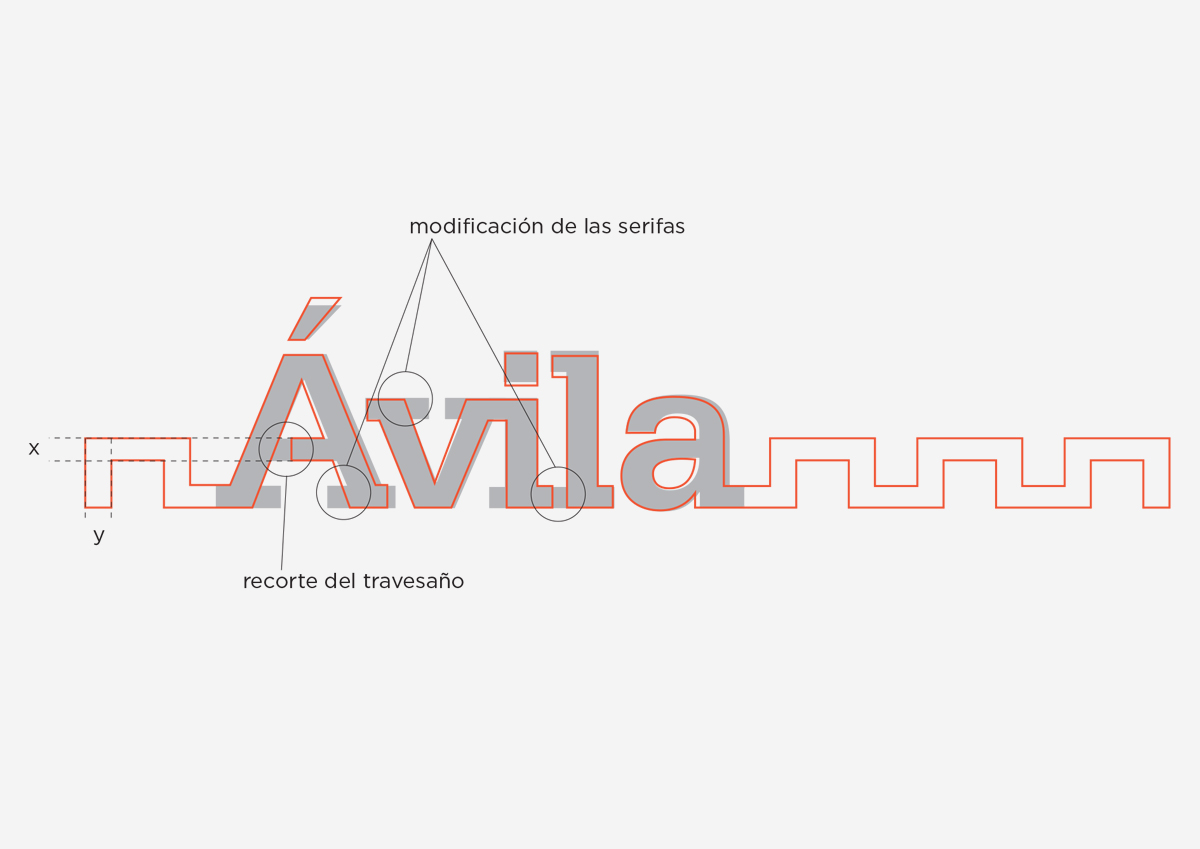
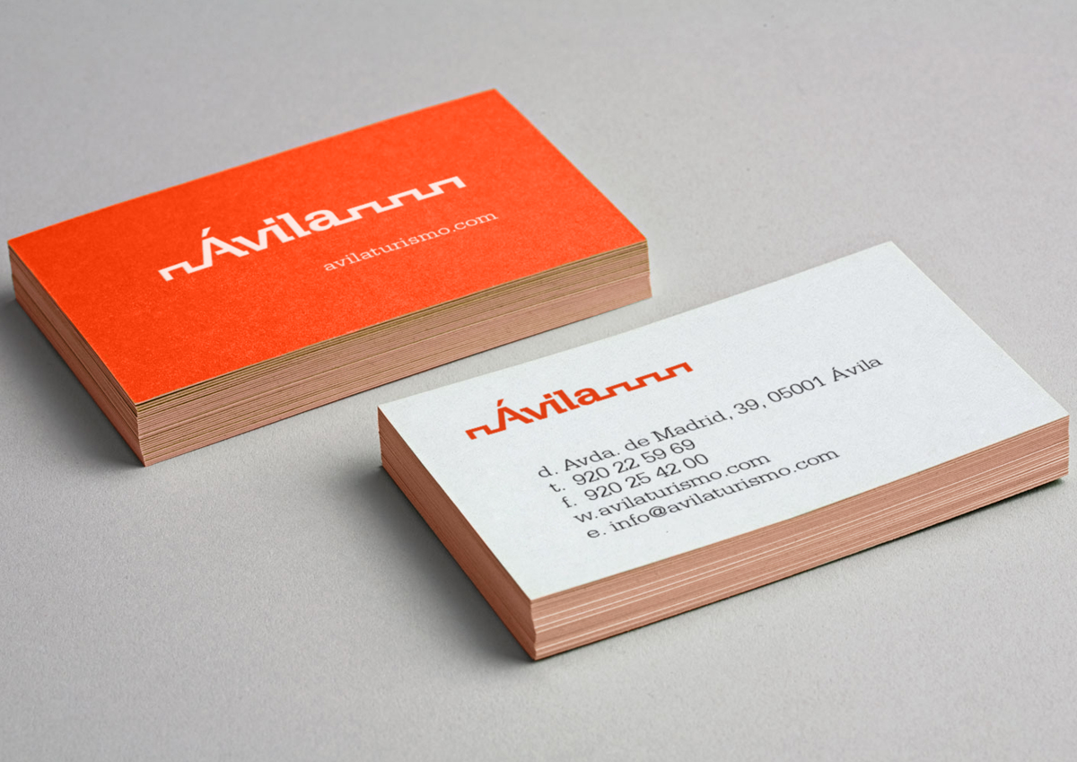
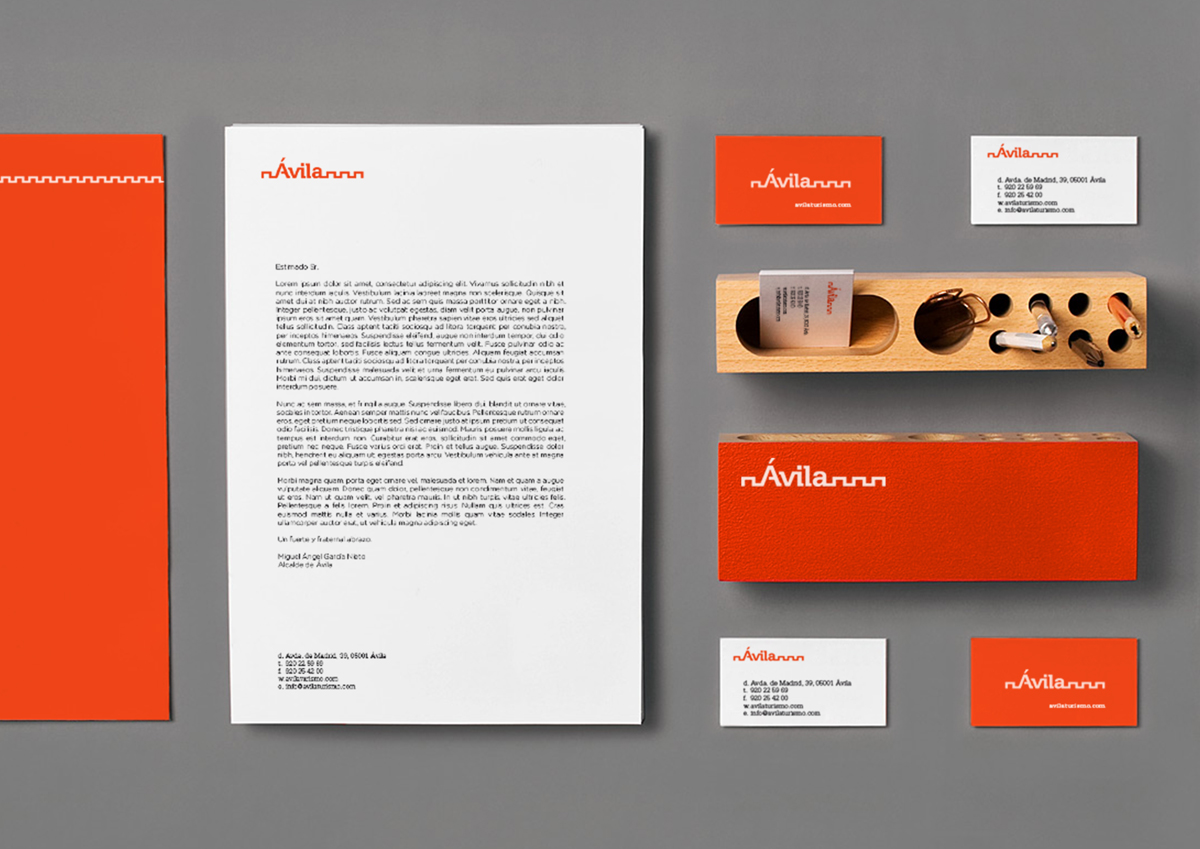
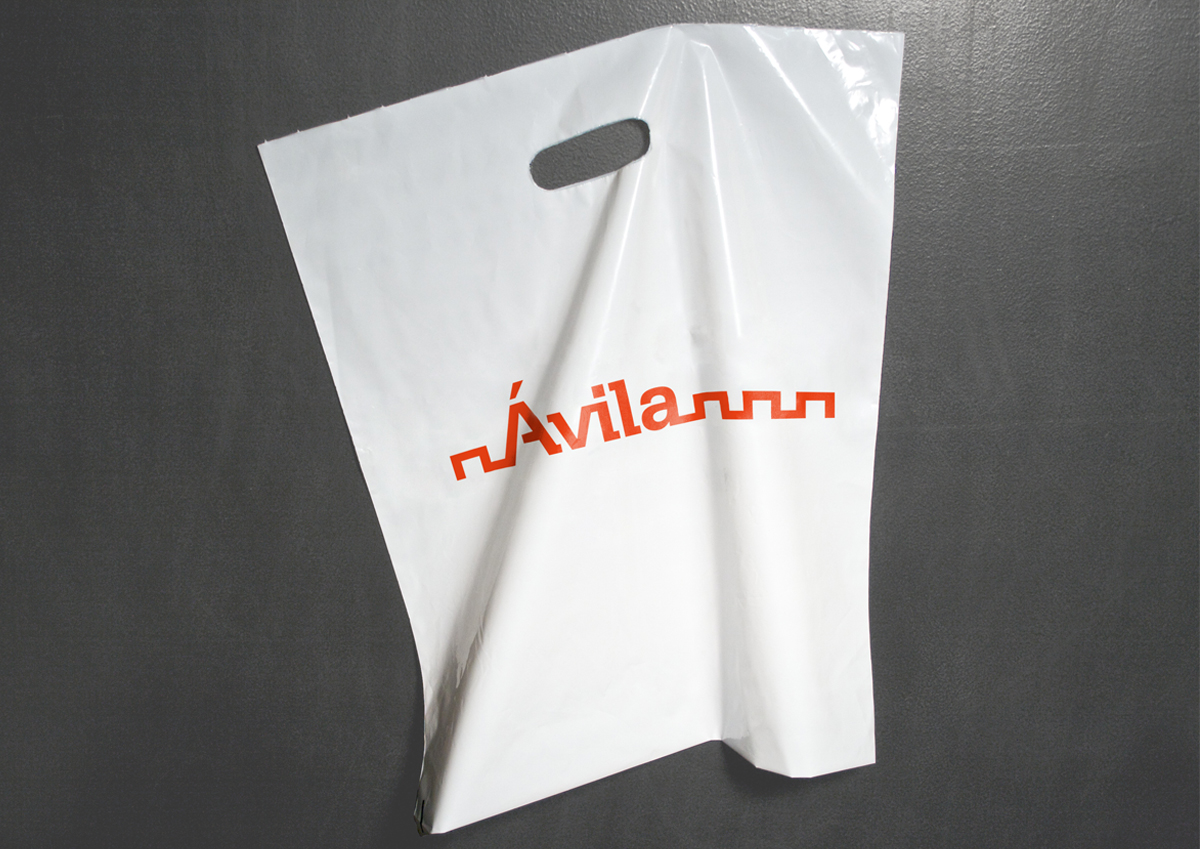
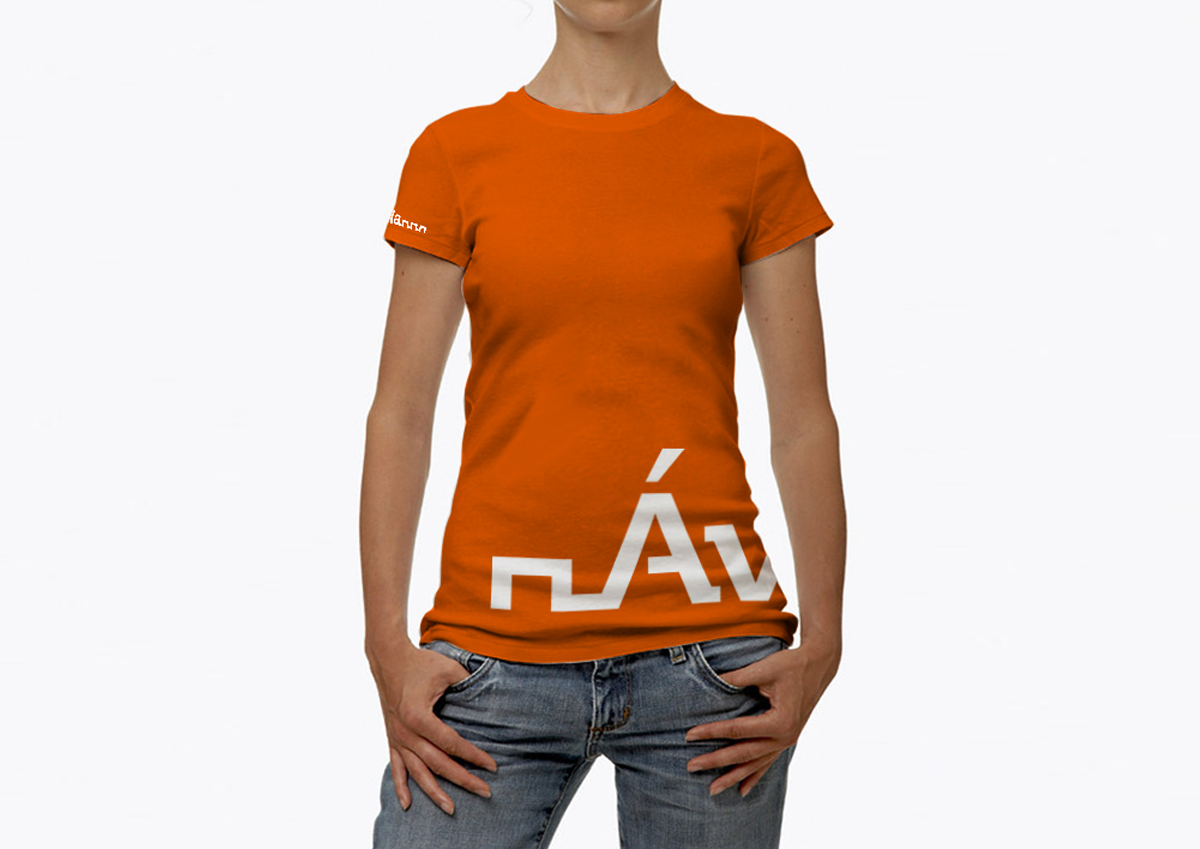
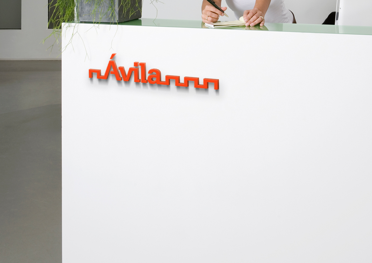
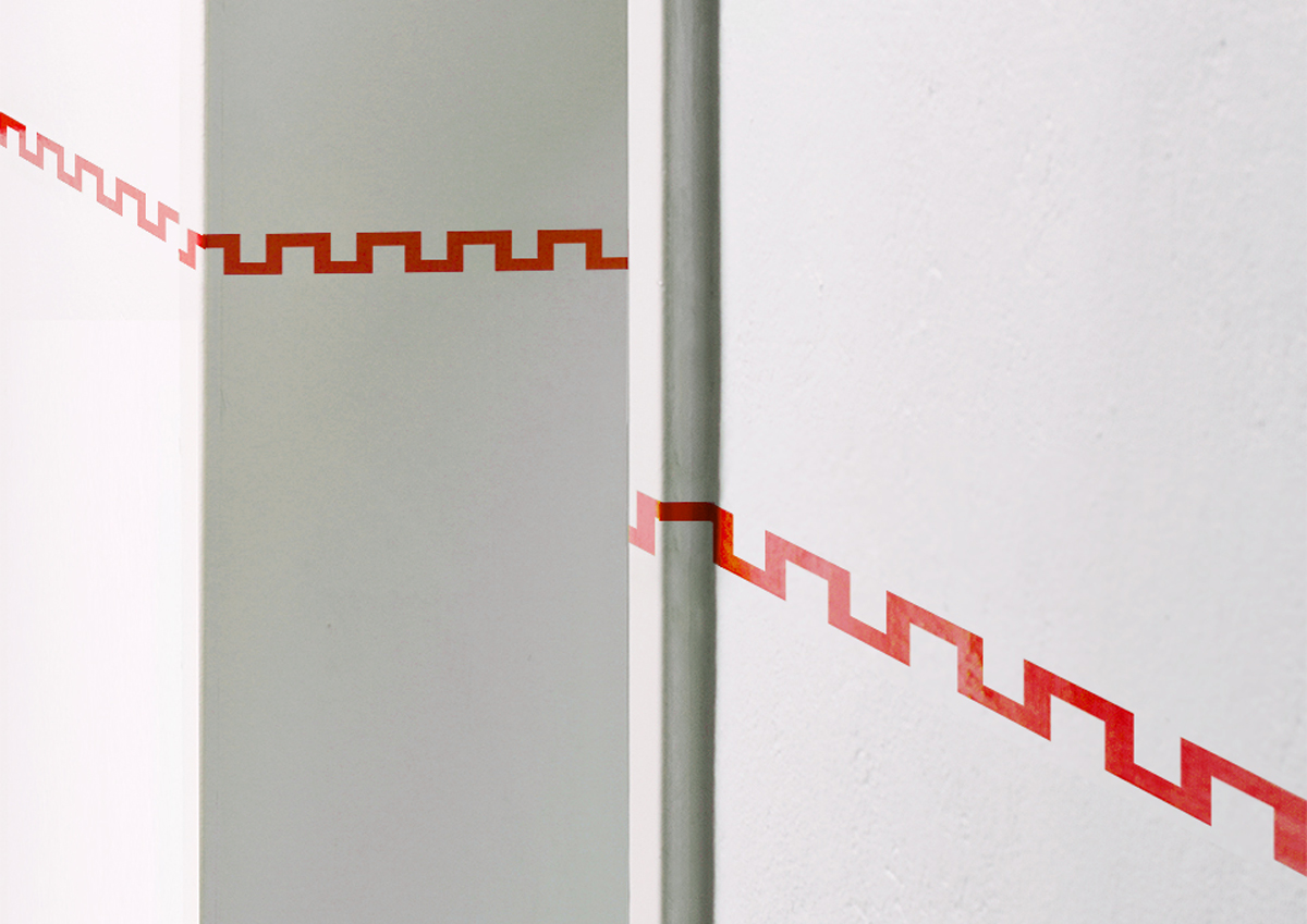
A forceful font with bold slab serif and clean lines. Ávila city branding draws the battlement of the city wall. This two concepts reflect the strength and modernity of the city. I tried to reveal the dynamism on the symbol’s rythm and how it links with the logo.
Using uppercase and lowercase provide a sweet, accesible personality and a bright, warm red builds a friendly image.
ClientÁvilaServicesStrategy & brand designYear2009